For transplanted New Yorkers, a designer creates a colorful, California-cool home in Santa Monica.

The entry of a Santa Monica home announces its aesthetic goals. Designer John De Bastiani placed a painting by Marco Lorenzetto in the entry to suggest a contemporary take, while the green-blue Stark rug and a console with an oar-shaped base designed by De Bastiani from Allyon Furniture allude to the locale near the beach. The overhead fixture is from Circa Lighting; the lamps on the console are Bunny Williams Home. A custom Benjamin Moore paint color was used for the trim.
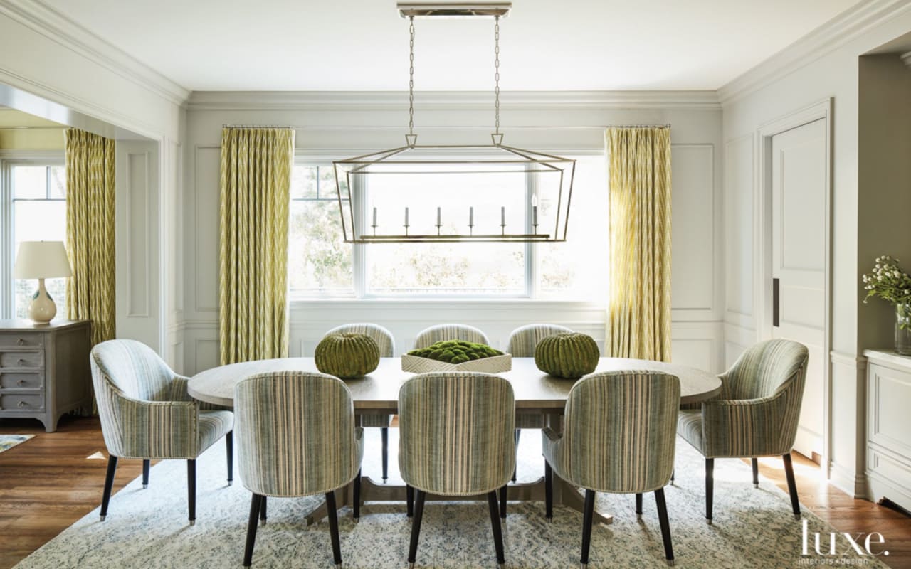
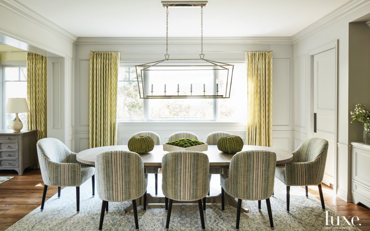
The homeowners entertain frequently. To that end, De Bastiani created a sophisticated, yet unfussy atmosphere in the dining room. A Circa Lighting pendant hangs above a dining table conceived by De Bastiani from Ayllon Furniture. The surrounding custom chairs from Villa Furniture are upholstered in Elizabeth Dow fabric. To tie the space to the adjacent living room, he used the same Schumacher drapery fabric in each.
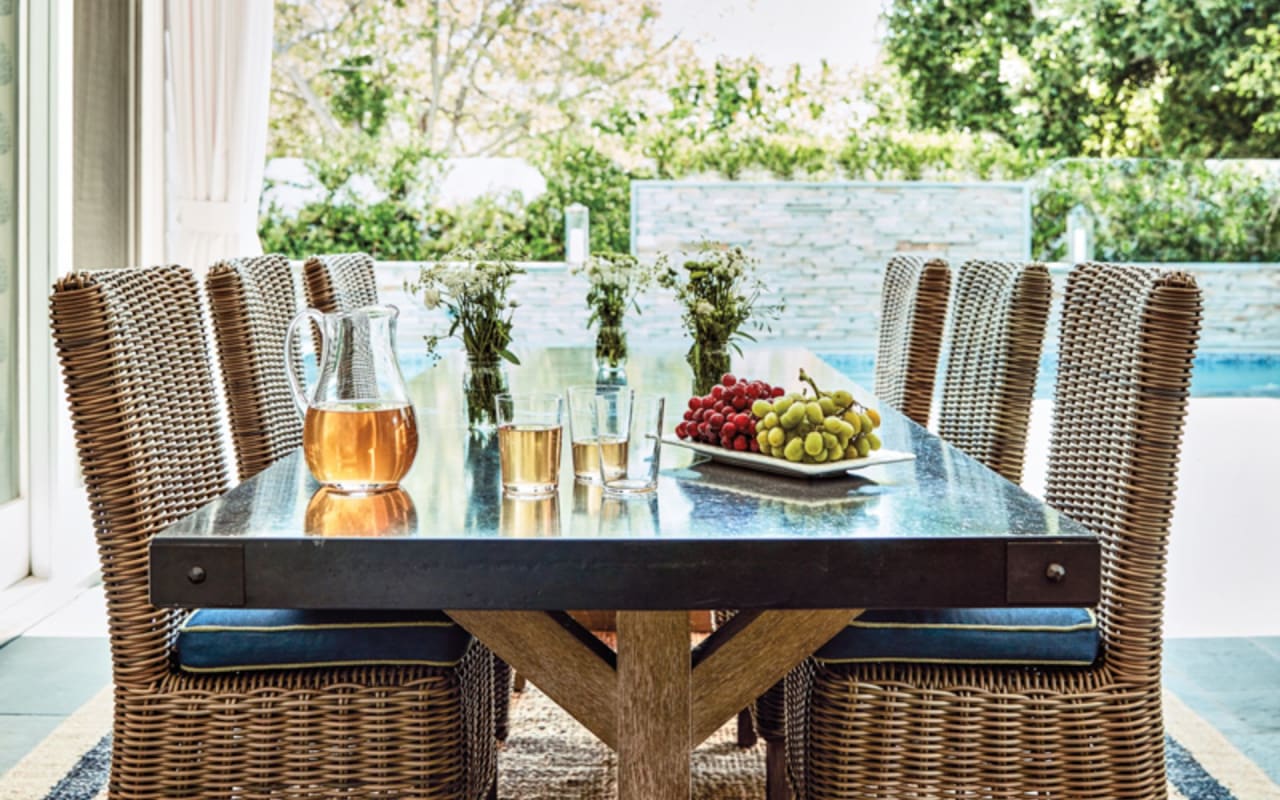
It's a very indoor/outdoor home," says De Bastiani. "They eat outside all the time." An RH table and chairs and a Serena & Lily rug keep things casual. The bell jar lantern from Circa Lighting illuminates the space in the evening.
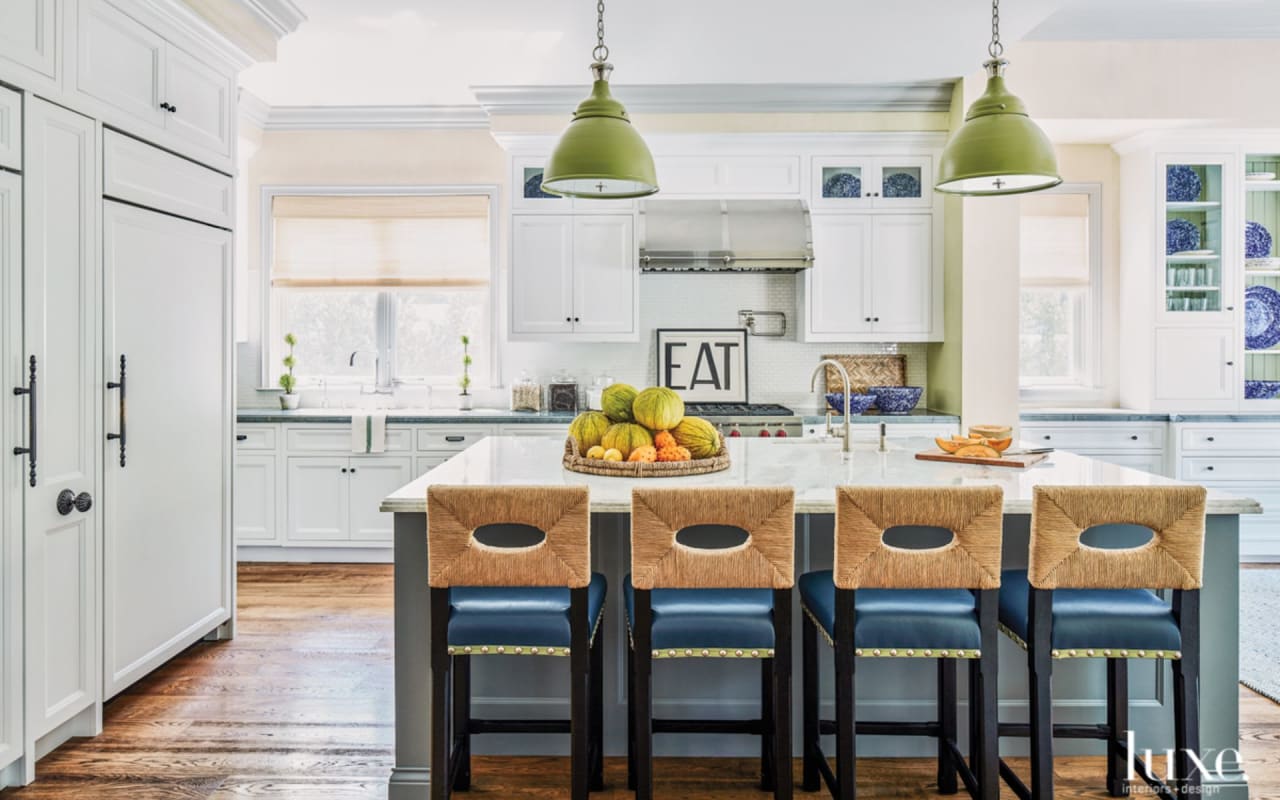
Architect Philip Vertoch's vision for the home emphasized airy spaces. General contractors Gordon Gibson and Jason Maltas built the residence. Ann-Morris pendants suspend above the kitchen's island. Pulling up to it are counter chairs of Bastiani's design from Allyon Furniture.

Custom pieces abound in the family room, including a sofa in Hinson fabric, a pair of custom chairs upholstered in Carleton V fabric and an ottoman in Jerry Pair leather. They all rest atop a Bunny Williams Home rug. The painting by Kerri Rosenthal is one of De Bastiani's favorite aspects of the room.

Subtle pattern on the walls adds texture to a hallway. The striped rug from Jamal's Rug Collection, the clients' own chest of drawers and globe pendants from Circa Lighting impart a cozy vibe.

Chloe the dog lounges on a rug from Jamal's Rug Collection in the master bedroom. De Bastiani wove in a variety of blue hues. He upholstered the RH bed's headboard in a patchwork of fabric and dressed it with a coverlet in hand-stitched John Robshaw fabric. The 19th-century settee at the foot of the bed is upholstered in Ralph Lauren Home fabric. The walls and ceiling are covered in China Seas wallpaper from Quadrille. Draperies in a Pindler fabric hang at the windows.
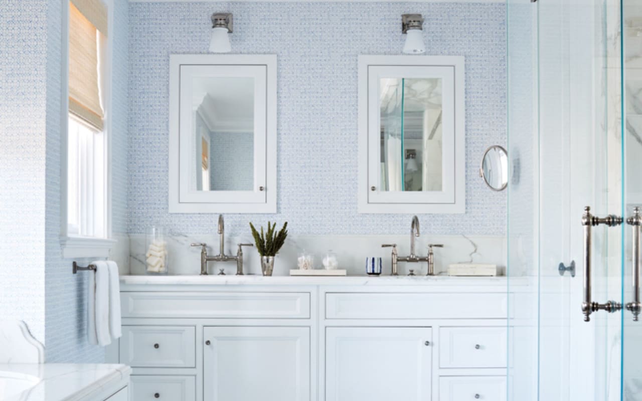
Quieter blue shades define the master bathroom. The wallcovering is by China Seas from Quadrille; the rug is from Jamal's Rug Collection. On the ceiling is a flush-mount fixture from Circa Lighting.
HOUSE DETAILS
Style:
Transitional
Produced By:
Lisa Bingham Dewart
Photography:
Joe Schmelzer
Interior Design:
John De Bastiani,
John De Bastiani Inc
Architecture:
Philip Vertoch,
Vertoch Design Architects
Home Builder:
Gordon Gibson And Jason Maltas,
Gordon Gibson Construction
Moving from the East Coast to the West Coast requires material as well as geographic trades. Flip-flops instead of boots, for instance. And it can mean swapping out bigger things–furniture or even an entire aesthetic. Such was the experience of a family moving from New York to Santa Monica. “Our New York house was very dark,” the wife says. “We wanted the opposite of that: something cheerful, happy and user-friendly.” This clear directive made perfect sense to designer John De Bastiani, who saw a bright, jubilant interior as totally reflective of the homeowners’ outgoing personalities. “They’re very fun people,” he says. “And they wanted something fresh and youthful.” The nearby beach also helped set the tone, but De Bastiani wanted to do it in a subtle way. “My goal was slightly beachy,” he says. “But it’s a family house so not too coastal.”
The clients were already settled into their abode when they called on De Bastiani. “We needed to take a breather,” explains the wife, who, with her husband, had engaged architect Philip Vertoch to fashion the new residence. Working alongside general contractors Gordon Gibson and Jason Maltas, Vertoch aimed to create an airy and practical family home. “I always try to have an open house flow and that was particularly important with these clients,” says Vertoch. Adds Maltas, “We implemented Philip’s design for a traditional but open floor plan intended for the family to enjoy the Southern California climate and life near the beach.”
While De Bastiani’s strategy for the interior was definitely colorful and somewhat casual, one of his first gestures was to highlight some of the home’s more classic architectural details, opting to paint the trim in the public rooms a light gray. “It helped everything sort of pop,” says the designer. Against that neutral backdrop, he brought in blue and green with touches of yellow. That cheerful palette is established early on: The front door is painted a teal shade and the patterned carpet in the foyer features a similar hue. “It gives a nod to being on the water,” he notes. A sunny but understated wallcovering brings in texture, depth and richness, while a black-and-white abstract painting–perched above a console with an oar-shaped base that imparts a nautical vibe–signals a departure from any rigid adherence to tradition. “It’s a little slice of what the rest of the house is going to look like,” shares De Bastiani.
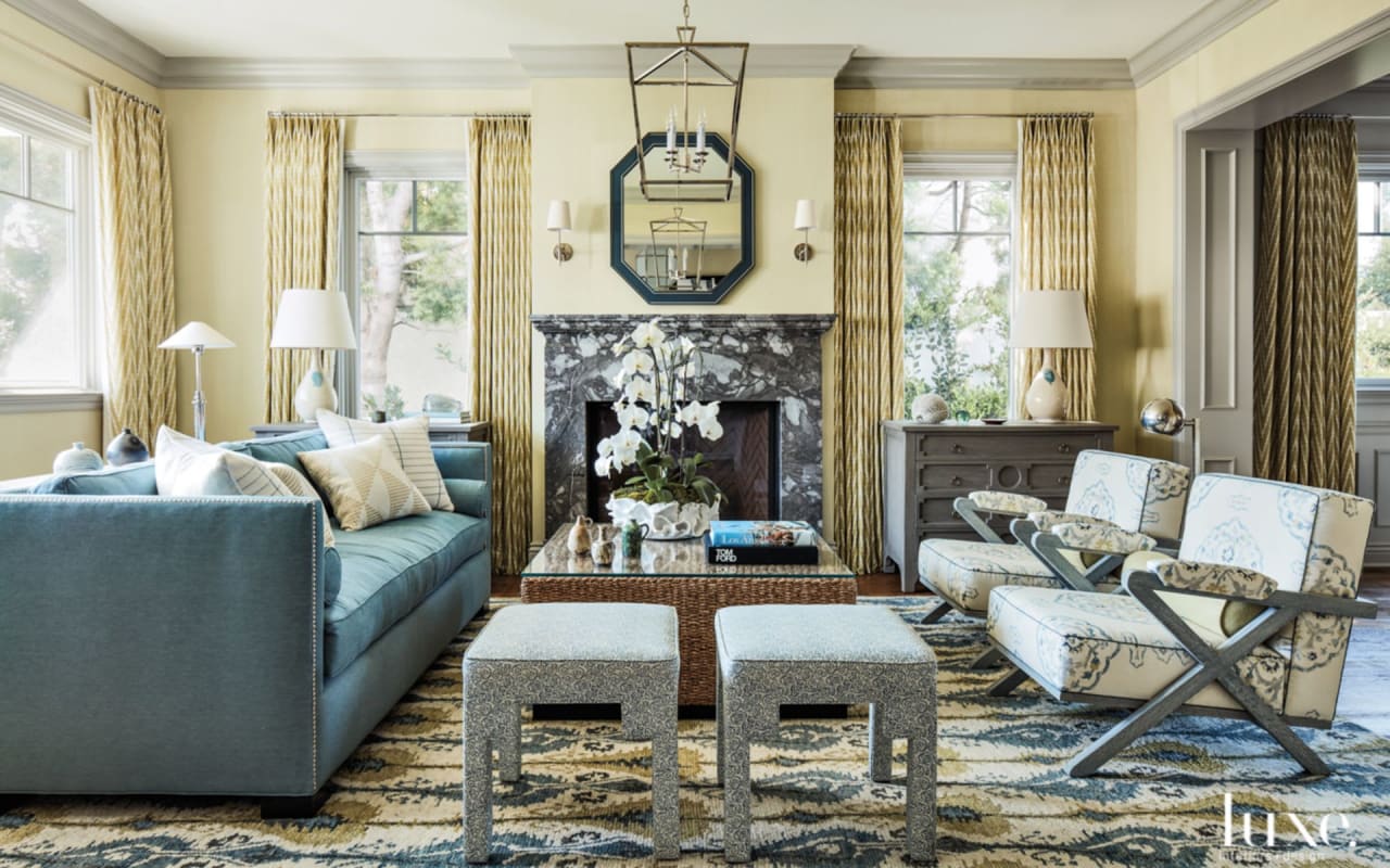
In the living room, just off the entry, the designer maintained the sand, sea and sky theme, beginning with the eye-catching rug and continuing with the tailored furnishings. He incorporated chairs with a maritime feel, while lamps and midcentury pottery contribute a welcoming warmth. “It gives soul to the room,” says De Bastiani, adding, “They wanted a place where they could hang out and have company.” The color scheme extends to the adjacent dining room, but the designer painted it gray to give it a distinctive ambience. “The gray makes the whole room seem wainscoted, but it’s not,” he says. “It’s different enough from the living room, but we used the same curtains to tie it together.” The easygoing atmosphere of the room means it gets used far beyond the usual special occasions and holidays. “I’m fortunate that my husband is a fabulous cook,” says the wife, “so we really love having people over.” And with a De Bastiani-designed table that extends up to 10 feet, it’s easy for the couple to host a 10-person dinner party.
A focus on entertaining meant the kitchen also played an important role. The rope stools and gray tones on the cabinets keep the room from having a stark feel, as do the avocado green pendant lamps above the island. “At first the clients were unsure of those. They thought they were too bright,” says De Bastiani. “They loved them when it was done.” The table in the breakfast area also took a little bit of a push. “I had to convince them to get a round table,” he says. “But they eventually loved it because you can talk to anyone across from you in any spot.”
De Bastiani also took some risks in the master bedroom, creating a patchwork fabric with which he upholstered the bed’s headboard. “It’s really interesting and unique,” he says. “You can’t just go and buy it.” A large-scale print wallpaper in shades of blue provides another layer of drama. “It’s definitely a little gutsy,” he says. “But not crazy gutsy–it’s still calming.”
Perhaps no other room epitomizes the home’s light and joyful decor better than the family room, though. “It’s really refreshing,” De Bastiani says of the bright blue and chartreuse hues he used. It’s also a place that can take a beating–a necessity with four kids in the house. “It’s pretty, and durable and comfortable–it just ties it all together,” says the designer. “I think people look at it and they say, ‘Oh, it is really happy.’ ” Designer Kara Hebert, who led the project, spent her childhood in Jupiter riding her bicycle to the beach and taking family boating trips to the Bahamas–idyllic experiences that have “influenced my work and my lifestyle,” she says. Her latest endeavor is no exception: Hebert incorporated variations of soft blue throughout every room, creating a soothing atmosphere in the home by residential designer Dennis Rainho and general contractor Michael Maxwell. To ensure the pervasive primary color is subdued yet engaging, she incorporated shades of white and gray, introduced prints and presented varying hues and textures. The result is a seamless, calming getaway.
Source here.
